Vassar Building Center — Beacon Award for Best New Store Over 20,000 sq. ft.
Chris Jensen

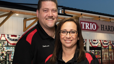
Mike and Brenda MacKay are thrilled to have a new, bigger store that serves the entire community. The addition of The Color Bar is one of the reasons for a 90 percent increase in female shoppers.
Vassar Building Center
Vassar, Mich.
Larry and Shirley Putman took over Vassar Building Center in Vassar, Mich., in the 1980s, joined first by their daughter Brenda and then later by her husband, Mike MacKay. In 2011, the MacKays bought the 10,000-square-foot business from Brenda’s parents.
By 2019, the MacKays had built the business into a thriving pro lumberyard, but the existing building just couldn’t support their vision for continued growth. To attract a new segment of shoppers, they knew they needed a larger store. Fortuitously, a large empty lot next door became available.

The exterior’s modern color palette enhances easy-to-read signage that places focus on the store’s name.
The MacKays saw an opportunity to expand their footprint, so they turned to their wholesaler for guidance. Do it Best was developing an innovative new store design for the next generation of stores, and the MacKays eagerly stepped forward to become the first to feature the design. Overcoming slowed construction due to the pandemic, the new Vassar Building Center opened in October 2020.
An interesting twist is the fact the project’s design was headed up by Do it Best Store Development Manager Cherié Jacobs, who had once worked as a designer at Vassar right out of college.
Says Mike, “She outgrew drawing house plans for us. I encouraged her to find the right company and she started at the ground level at Do it Best and now she’s running the store design team. When she came back with the renderings, we were like, ‘Wow, that’s incredible.’”

Vassar Building Center’s new store served as the prototype for Do it Best’s new store design program.
A STORE WITH WIDE APPEAL
The exterior’s modern color palette enhances easy-to-read signage that places focus on the store’s name. A large red awning draws the eye to the entrance of the brightly lit store and its welcoming atmosphere.
The new store’s 20,000-square-foot retail space was nearly double the size of the old store. The open sightlines combined with wider aisles offer easier navigation and a cleaner, more organized shopping experience for customers.

The open sightlines combined with wider aisles offer easier navigation and a cleaner, more organized shopping experience for customers.

Signage around the perimeter of the store includes oversized wall graphics featuring historic photos from Vassar’s past.
“The old building was just a contractor store,” Mike explains. “We needed a store that had curb appeal and was more attractive for female and young customers with current color schemes, that flowed better and was easier to shop.”
Signage around the perimeter of the store includes oversized wall graphics featuring historic photos from Vassar’s past, inspirational messages about shopping local and promotional product images, all selected by the MacKays. Says Mike, “We love being able to tell our story and highlight the history of the company. It’s a great reminder that the Vassar brand has been serving the community for more than 50 years.”
The extra square footage allowed the MacKays to expand departments like grills, outdoor furniture, tools, hardware and plumbing, while tripling the size of the kitchen and bath design center.
One category people thought was new for Vassar is workwear and boots. In the new store, this section is featured prominently up front. “At the grand opening, and for quite a while afterward, customers remarked how glad they were that we now carried work boots,” Mike recalls. “We always carried them—people just didn’t notice them in the old store. This is just one change that’s helped us attract many new customers.”
Another design feature that captures customers’ attention is their reimagined end caps. End caps in the old store were strictly promotional, focusing on a single product at a great price. These new storytelling end caps are set back, lower and wider, and they tell a product story with related items and engaging photography.

Doubling the square footage allowed the MacKays to expand departments like grills, outdoor furniture, tools and hardware, while tripling the size of the kitchen and bath design center.
ATTRACTING FEMALE CUSTOMERS
Having deeper and broader categories has attracted more female shoppers, something Mike had hoped for at the beginning of the project.
“We’re a full-service lumberyard with a huge selection of building supplies to serve pro contractors. That’s our biggest niche, and it always has been,” Mike says. “But this was a way to broaden our reach, become a hardware destination and be able to serve the entire community with a modern home center.”
The new store has seen about a 90 percent increase in female shoppers compared to the old location. Mike recalls seeing many women waiting out in the car at the old store while men came in to grab supplies. “Today, they’re coming in with their kids, and couples are shopping together for appliances, paint and housewares. We never had housewares in the old store. Now we have lots of opportunities to sell things we never thought of before.”
The paint department was upgraded with the addition of The Color Bar, an interactive and comprehensive paint destination. This is another area where the MacKays have witnessed an uptick in female shoppers and couples.

Workwear and boots were moved to a prominent position in the front of the store, which resulted in customers noticing the category for the first time.
A NEW MINDSET FOR THE RESET
Both the wall graphics and the wayfinding signage are so noticeable throughout the store because keeping vertical spaces open is an important aspect of their new store’s design strategy.
“Once you’re inside, you can see almost all the way across the store,” Mike says. “We’re not piling merchandise up high anymore, because we’ve learned that you don’t have to show everything you have. We now place one or two of each item up front, and the rest are in the back. And that opens up really great sightlines throughout our store.”
The open sightlines combined with wider aisles not only offer their customers easier navigation, but also a cleaner-looking, more organized shopping experience. “We have gotten a lot of compliments from our female customers and families—they say it’s easy to shop here,” Mike points out.

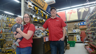
The MacKays’ oldest son, Tanner, has taken on increased responsibility with the business.
STEADY GROWTH
Sales increased 23 percent the first year, while customer counts rose 20 percent and average transaction was up 6 percent. Says Mike, “Customers tell us they love our store and they can now get everything they need from us.”
The new, expanded store positions the family business for another generation. Their oldest son, Tanner, started at 14 sweeping floors, coming back to the business full time after college in 2017. Tanner’s duties now include yard supervisor, hiring, labor scheduling, purchasing and inventory control. Says Mike, “We’re very proud of where he’s headed, and hopefully he will take over the company in the future.”
Future projects include implementing a rewards program to track and incentivize all those new shoppers, developing a more robust ecommerce website and adding a drive-through component to the lumberyard. Looking back, the only thing the Mackays say they would’ve done differently with the new store is build it even bigger.
Mike says they are humbled their store was picked to be the Beacon Award winner for Best New Store. “We owe a lot of kudos to the great people at Do it Best and the staff who got us where we are today,” he says. “It’s a great accomplishment, but the challenge is to get better and keep the store up so the community continues to have a great shopping experience.”


